The 'Micro-Moment' Architecture: Designing Your Site for Impatient Customers
Modern users make split-second decisions based on immediate satisfaction. Here is how to restructure your website to capture these micro-moments before your competitors do.

The Shift from Browsing to Searching for Solutions
In the era of infinite scrolling and high-speed mobile connectivity, the way potential customers interact with your website has fundamentally shifted. Gone are the days of users carefully navigating through 'About Us' pages and detailed service menus to decide if they trust you. Today, users operate in 'micro-moments'—the split-second windows of time where they turn to a device to act on a need to know, go, do, or buy.
If your website architecture isn't built to facilitate these rapid-fire interactions, you are losing visitors within the first three seconds. At Ghost Coyote Web Design, we view this not as a design flaw, but as an architectural challenge.
Understanding the Anatomy of a Micro-Moment
Micro-moments occur when a user's intent is at its peak. They aren't looking for a deep brand story; they are looking for a friction-free path to a solution. Whether it is checking your service hours, finding a pricing table, or initiating a chat, every second of hesitation on your site is a reason for a user to click the back button.
Mapping User Intent to Site Structure
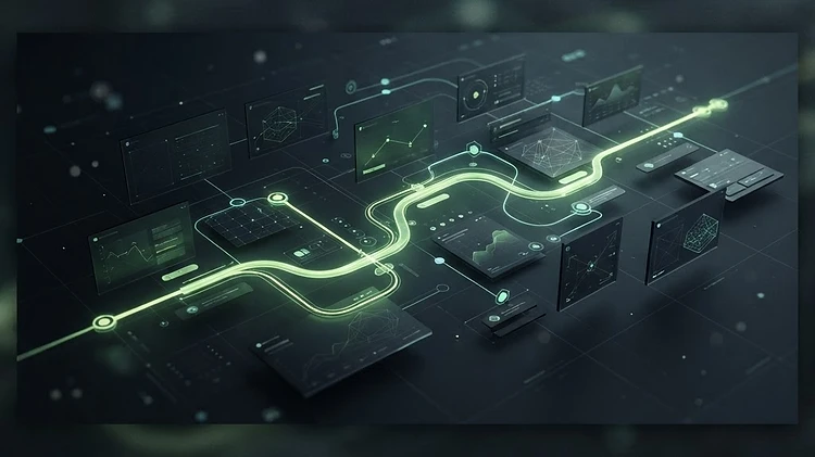
To capture this traffic, your site must move away from static, brochure-style layouts. Instead, you need a dynamic, intent-based structure. Start by auditing your top-performing landing pages. Are they answering the user's question immediately, or are they hiding the answer behind excessive branding?
The 'Three-Click' Rule is Dead
For years, we were told users should reach their destination within three clicks. In the micro-moment economy, three clicks is too many. Your primary value proposition and call-to-action (CTA) should be visible above the fold, providing immediate utility without a single click required. If a user has to dig to understand what you do or how to engage with you, your architecture has failed.
Practical Steps for Micro-Moment Optimization
How do you pivot your current site or plan your new build to accommodate this impatient behavior? It starts with a philosophy of radical accessibility.
Prioritize Contextual Navigation
Rather than forcing users to navigate through a dense global menu, implement contextual links that appear based on where the user is in their journey. If they are reading about your e-commerce development services, provide an immediate, inline link to a case study or a 'get a quote' button. Remove the need for them to mentally reorient themselves by leaving the page.
Optimize for 'Thumb-Driven' Interaction
Most micro-moments happen on mobile devices. Design your buttons, input fields, and navigation elements to be easily accessible by a user's thumb. This sounds basic, but many sites still bury crucial information in sub-menus that require precision clicking. Large, clear, and high-contrast CTA areas are essential for converting impatient mobile users.
Simplify the Data Hand-Off
If a user wants to connect with you, do not demand their life story. A micro-moment is an expression of immediate interest, not a commitment to a long-term relationship. Keep inquiry forms to the bare minimum—name, email, and a simple drop-down for the service they are interested in. You can qualify the lead later; right now, you need to minimize the friction of them reaching out to you.
The Role of Speed and Performance
Architecture is useless if the site takes four seconds to load. Micro-moments require micro-load times. If your site is sluggish, the user has already left before the first image finishes rendering. At Ghost Coyote, we emphasize server-side optimization and lazy-loading techniques that ensure the 'above-the-fold' content is available instantaneously, even on sluggish cellular networks.
Final Takeaway: The 'Utility-First' Mindset
Stop viewing your website as a digital billboard and start viewing it as a utility tool. When a user arrives at your site, they are not visiting to admire your design choices; they are there to solve a problem. By streamlining your architecture to serve that need in the smallest possible window of time, you stop being a digital destination and start being a digital solution. If you're ready to audit your site's architecture, Ghost Coyote is here to help you pivot to an intent-driven strategy.