Mobile-First Design: Why It's Not Optional
Over 60% of web traffic is mobile. If your site isn't mobile-first, you're losing more than half your audience.
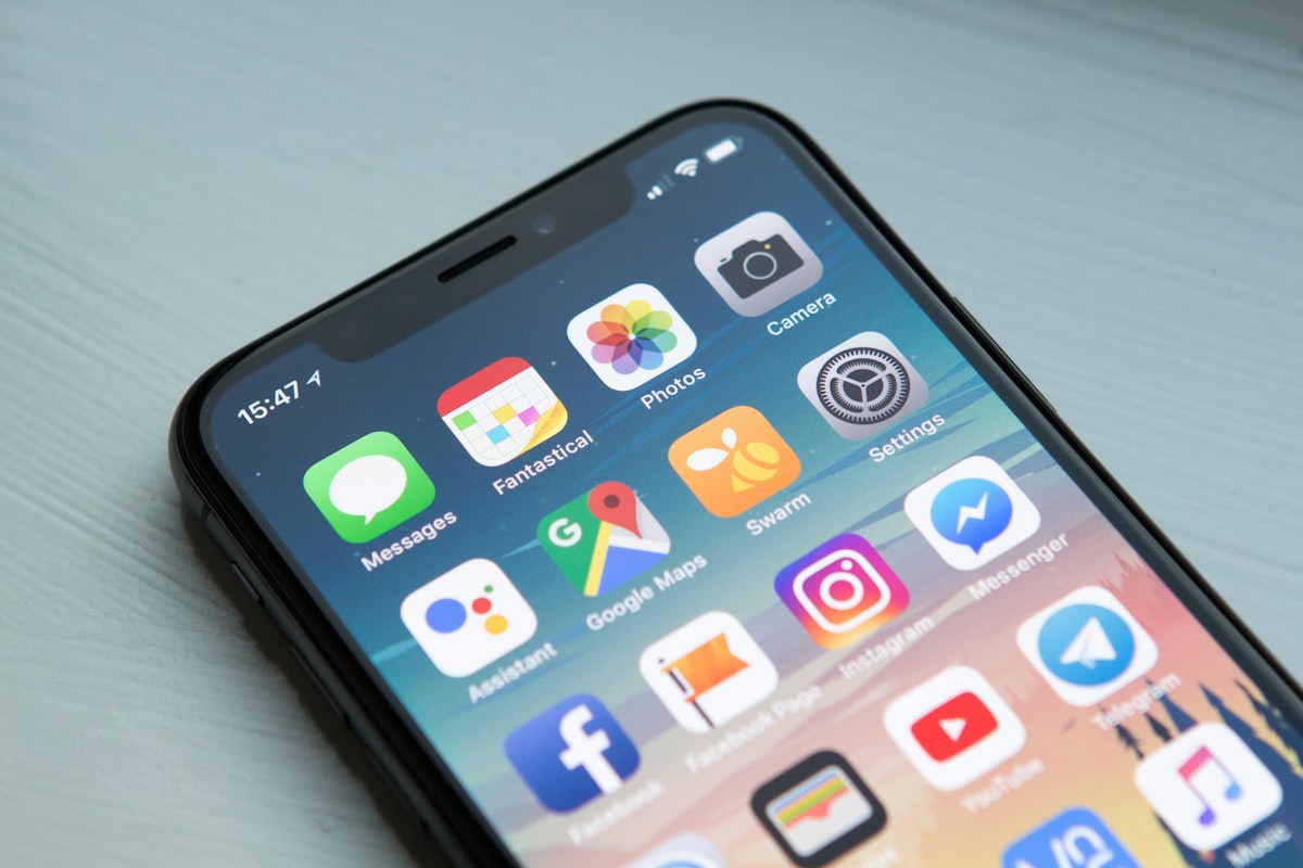
The Mobile Reality
Over 60% of all web traffic now comes from mobile devices. Yet countless businesses still treat mobile as an afterthought — designing for desktop first and hoping it shrinks down acceptably.
That approach is costing you customers.
What Mobile-First Actually Means
Mobile-first isn't just about making your site responsive. It's a design philosophy that starts with the mobile experience and scales up. This means:
- Designing the mobile layout before the desktop layout
- Prioritizing touch interactions over hover states
- Minimizing content to what matters most on small screens
- Ensuring fast load times on cellular connections
The Cost of Getting It Wrong
Google's research found that:
- 53% of mobile users abandon sites that take over 3 seconds to load
- 79% of users who are dissatisfied with a site's performance are less likely to buy from the same brand again
- 57% of users won't recommend a business with a poorly designed mobile site
Key Principles for Mobile-First Design
Touch-First Interactions
Buttons should be at least 44x44 pixels. Tap targets need enough spacing to prevent accidental clicks. Navigation should be thumb-friendly — the most important actions within reach of the thumb.
Performance Budget
Mobile users are often on slower connections. Set a performance budget and stick to it. Compress images, minimize JavaScript, and load non-critical resources lazily.
Content Hierarchy
On mobile, screen real estate is limited. Lead with what matters most. Cut the fluff. Every element should earn its place.
The Bottom Line
Mobile-first isn't optional — it's the baseline. If your website wasn't designed mobile-first from day one, you're starting from behind. Every site we build at Ghost Coyote Web starts with the mobile experience. Always.